Style & Trends
Wedding Color Palettes for 2027: 7 Picks
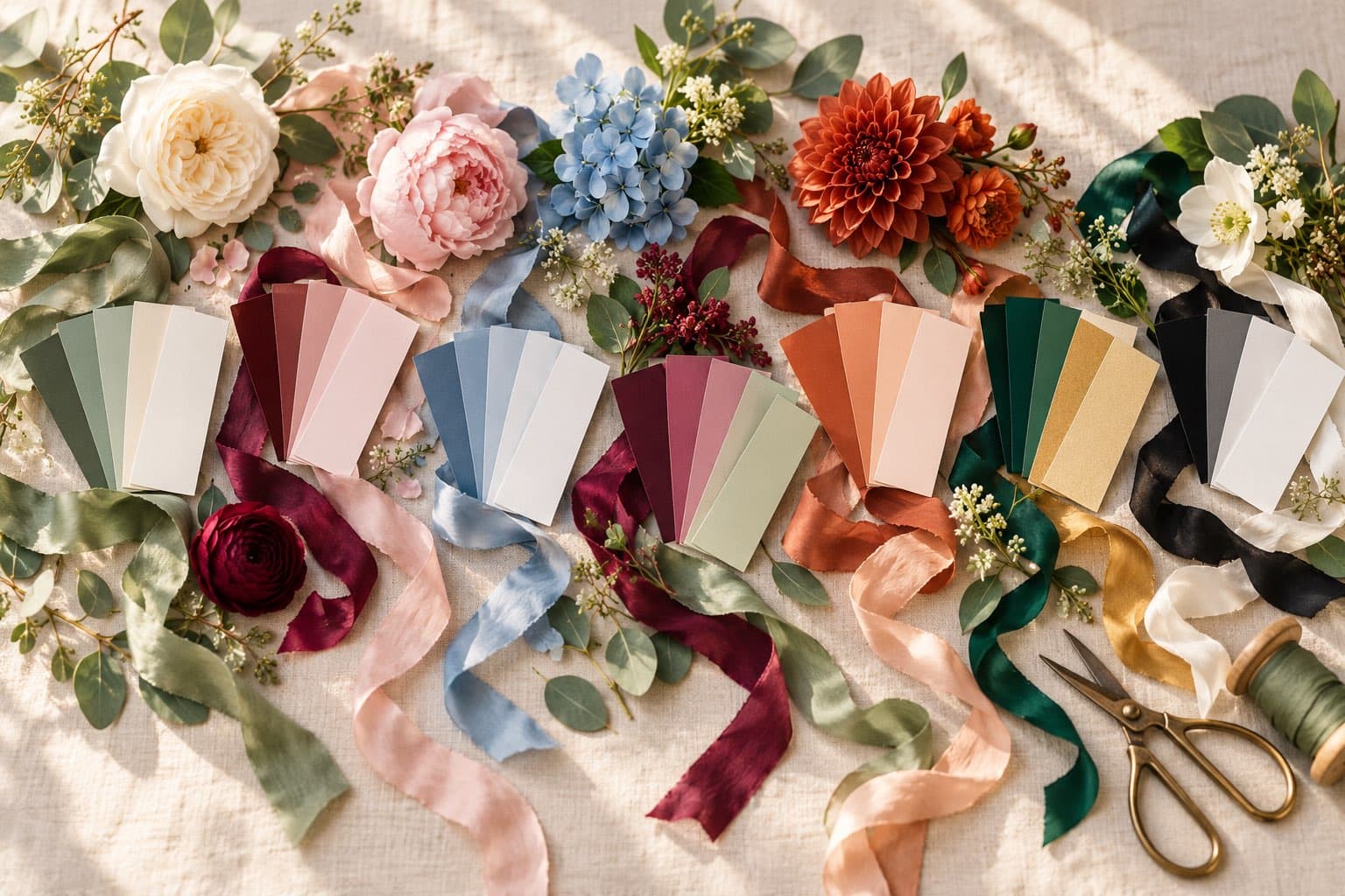
You've saved forty photos of flowers, tablescapes and bridesmaid dresses, and every one of them is lovely. Now comes the part that makes it all feel real: turning that dreamy little collection into colors that feel like the two of you.
We've gathered the seven palettes we can't stop thinking about for 2027, from soft garden greens to rich berry and timeless black and white. Each one comes with its swatches, the feeling it brings, and easy ways to make it yours. Then we'll share the one trick that makes choosing so much easier.
What will the 2027 wedding colors be?
Think natural and full of feeling. The colors couples are loving for 2027 lean toward garden greens, dusty blues and warm earth tones, with deep reds for a little drama and a renewed love for classic black and white.
Herbal green and ivory
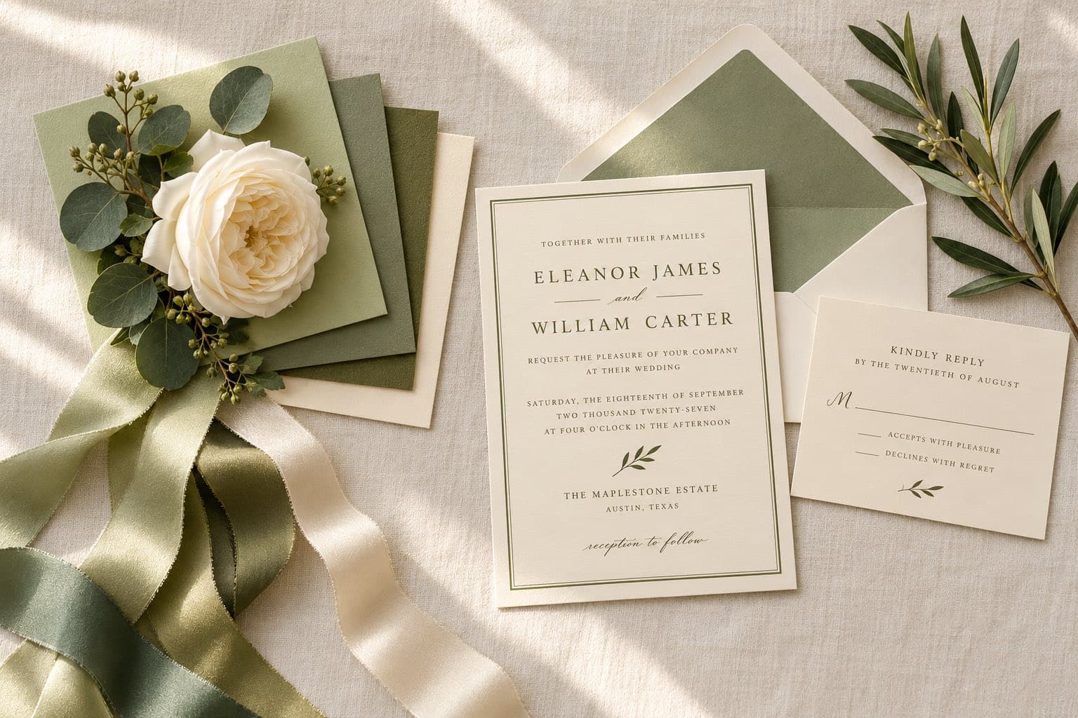
Picture a garden ceremony with eucalyptus spilling across the tables, ivory flowers catching the afternoon light, and sage green woven into every little detail.
This is you if: you love garden weddings, loose bouquets and natural details that look beautiful without feeling too planned.
It's our couples' most-saved palette, and it's easy to see why. These earthy greens go with every venue, from a mountaintop lodge to a vineyard, and greenery-heavy arrangements are often gentler on the flower budget.
How to bring it to life:
- A loose, garden-style bouquet of white ranunculus and silver dollar eucalyptus, finished with long silk ribbons that move when you walk.
- Olive branches and trailing greenery down the center of every table.
- Bridesmaids in sage, celery or a mix of greens, with groomsmen in tan linen.
Our tip: think of champagne or soft gold as this palette's jewelry. A little on your flatware, your ribbon or your invitation makes all that green feel finished.
In Vowfly, this is the Sage & Ivory palette, our couples' favorite. The Maren design, with white flowers and eucalyptus on a sage-mint watercolor, is a dreamy match. Eloise, a gold frame with baby's breath on white marble, is lovely if you'd like green as the supporting color.
Burgundy and blush
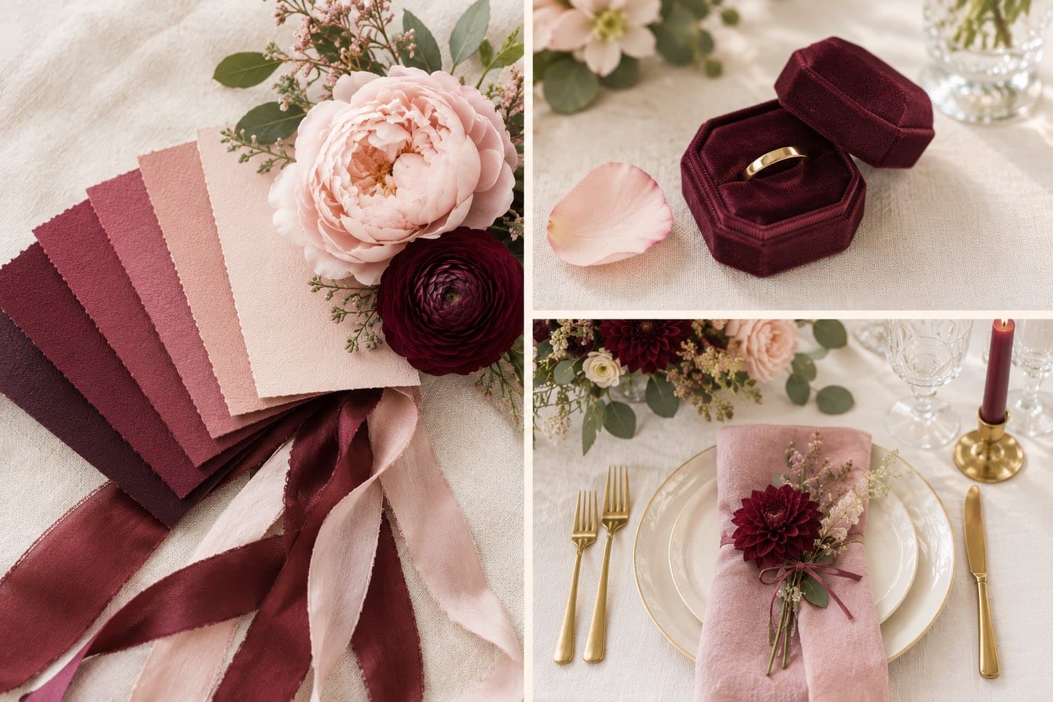
Deep burgundy roses, blush satin and candlelight dancing across the tables. This palette feels like a love letter brought to life.
This is you if: you love a little drama, save every candlelit wedding photo and want your flowers to make people stop and stare.
The two colors come from the same family, so they match without any effort, and blush keeps burgundy bridal instead of heavy. Deep red is one of the colors to watch for 2027, and this is the prettiest way to wear it.
How to bring it to life:
- Burgundy dahlias and garden roses with blush peonies and a little seeded eucalyptus.
- Burgundy napkins on ivory linens, with tall taper candles down every table.
- Blush bridesmaid dresses, and the groom in burgundy while his groomsmen stay neutral.
Our tip: burgundy has a warm, brown undertone, so it looks beautiful with natural wood and leather. A farm table or a leather-bound guest book makes the whole palette feel richer.
In Vowfly, this is Burgundy & Blush. The Genevieve design, watercolor burgundy peonies and blush roses with a little gold, carries both colors at once.
Dusty blue and white
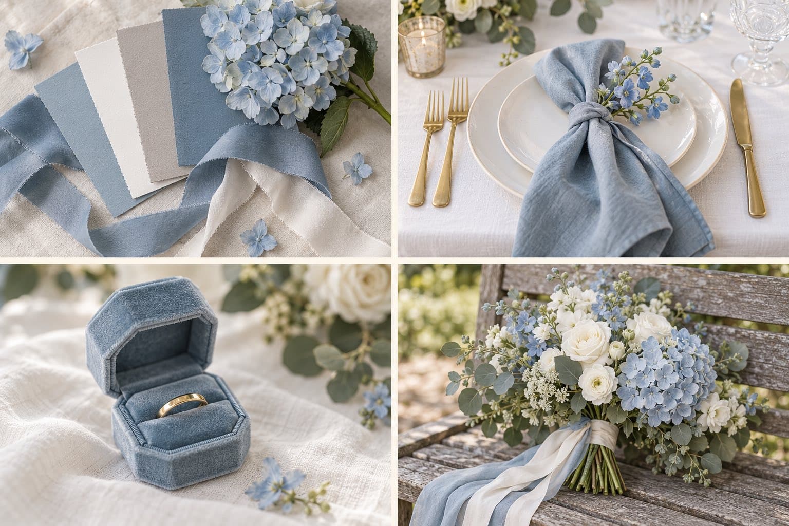
Dusty blue ribbons, white hydrangeas and the prettiest hint of color against an ivory tablecloth. There's something so lovely about keeping things simple.
This is you if: you're drawn to effortless elegance, classic garden flowers and colors that look just as beautiful at a backyard wedding as they do in a ballroom.
It's the most forgiving palette on our list. Dusty blue matches easily across linens, suits and flowers, it looks calm in photos, and it gives you your something blue without even trying.
How to bring it to life:
- Blue hydrangeas, delphinium and blue thistle with white lisianthus and cream roses.
- Dusty blue napkins tied with ribbon at each place setting.
- Gray suits with dusty blue ties for the groomsmen.
Our tip: dusty blue changes with what you pair it with. Add peach for a sweeter look, or a touch of copper or rust for a cozy fall wedding.
In Vowfly, this is Dusty Blue & White. The Wexford design, a dusty blue damask with white wreath medallions, is the match, and it comes in square, oval and diamond shapes.
Berry and sage
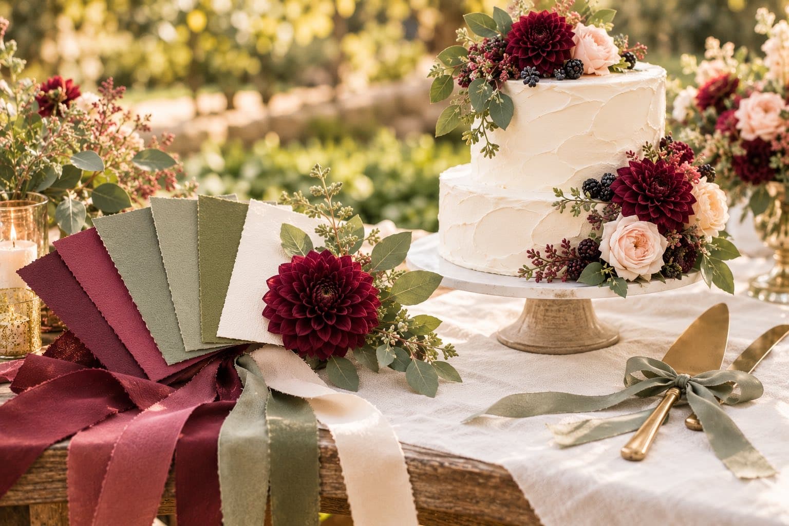
Imagine a garden party with raspberry-colored flowers, trailing greenery and a berry-topped cake waiting beneath the trees.
This is you if: you love overflowing flowers, vintage treasures and a garden party with a little unexpected color.
It's one of the most-chosen palettes on Vowfly. The berry brings the drama, the sage keeps it light, and cream holds the two together so it never feels heavy.
How to bring it to life:
- Wine-colored garden roses, plum dahlias and scabiosa with olive branches and trailing amaranthus.
- Real blackberries, figs and grapes tucked into your cake and centerpieces.
- Bridesmaids in a mix of berry, plum and dusty rose, holding greenery-heavy bouquets.
Our tip: put a little real fruit right into the bouquets and boutonnieres. A few berries among the blooms look gorgeous up close, and they're a detail your guests will remember.
In Vowfly, this is Berry & Sage. Genevieve, with its burgundy peonies, carries the berry on your invitation, and the palette brings the sage into your website.
Terracotta and peach
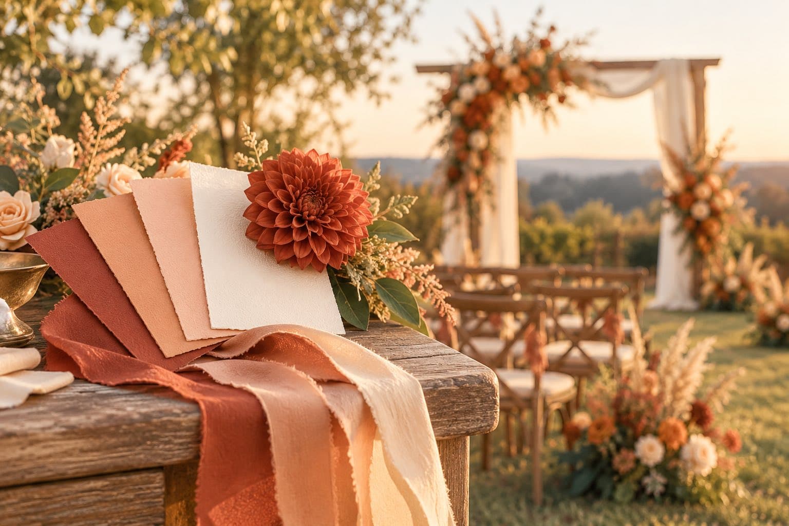
Think peach roses glowing in the late afternoon sun, terracotta candles on long wooden tables and a golden hour that seems to last forever.
This is you if: you love sunset colors, natural textures and a wedding where everyone feels right at home.
It's colorful but grown up. Peach is the sweet spot for anyone who finds pink a little too sweet and orange a little too loud, and the whole palette glows against natural wood, candlelight and open landscapes, from a barn to a backyard strung with lights.
How to bring it to life:
- Rust dahlias, toffee and peach roses and dried pampas grass in your arch and bouquets.
- Clay vessels, terracotta votives and oat-colored linens on the tables.
- Bridesmaids in terracotta or dusty rose satin, and peach ties for the groomsmen.
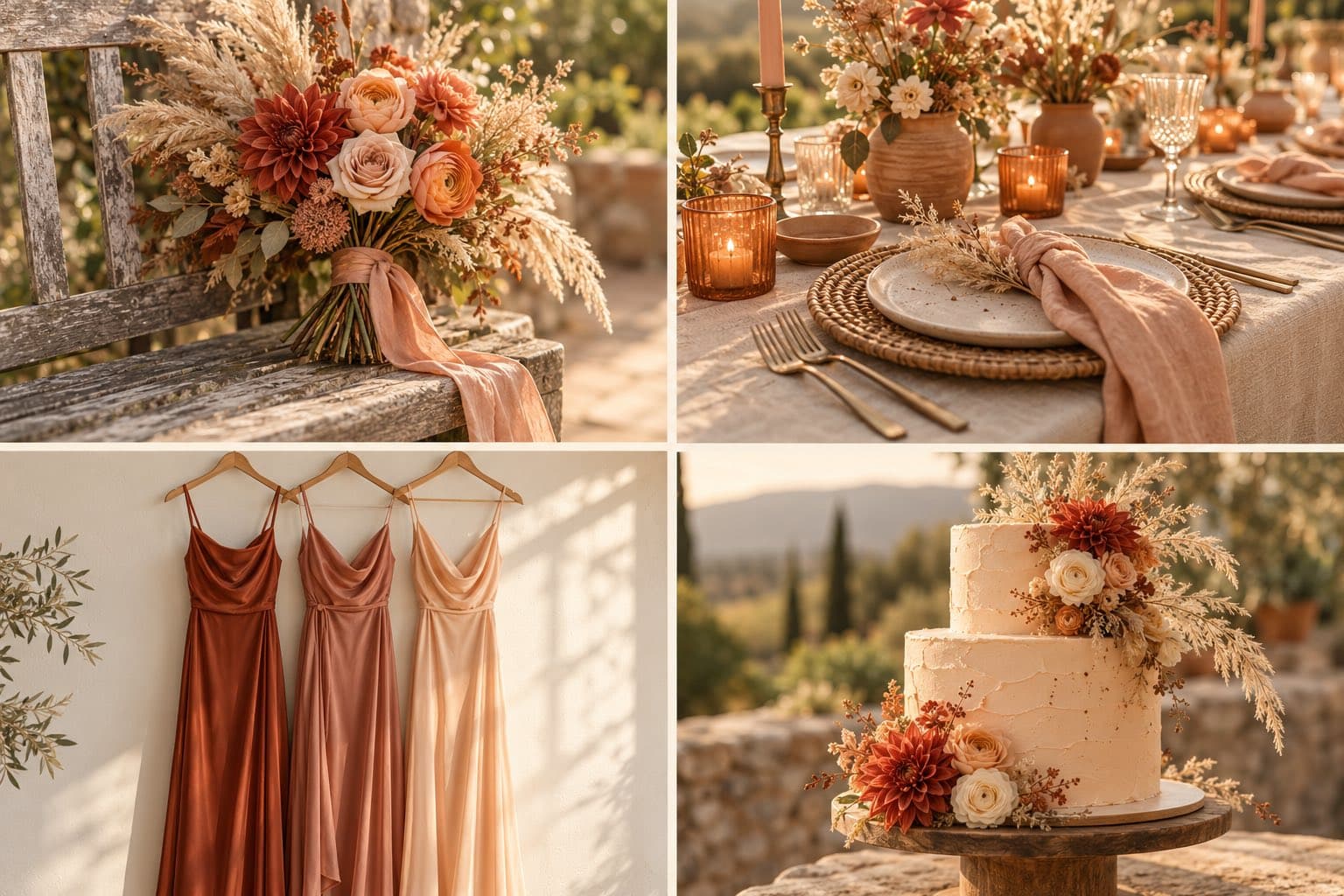
Our tip: mix a few dusty rose blooms into the terracotta. They soften the orange and make the whole palette feel even more inviting.
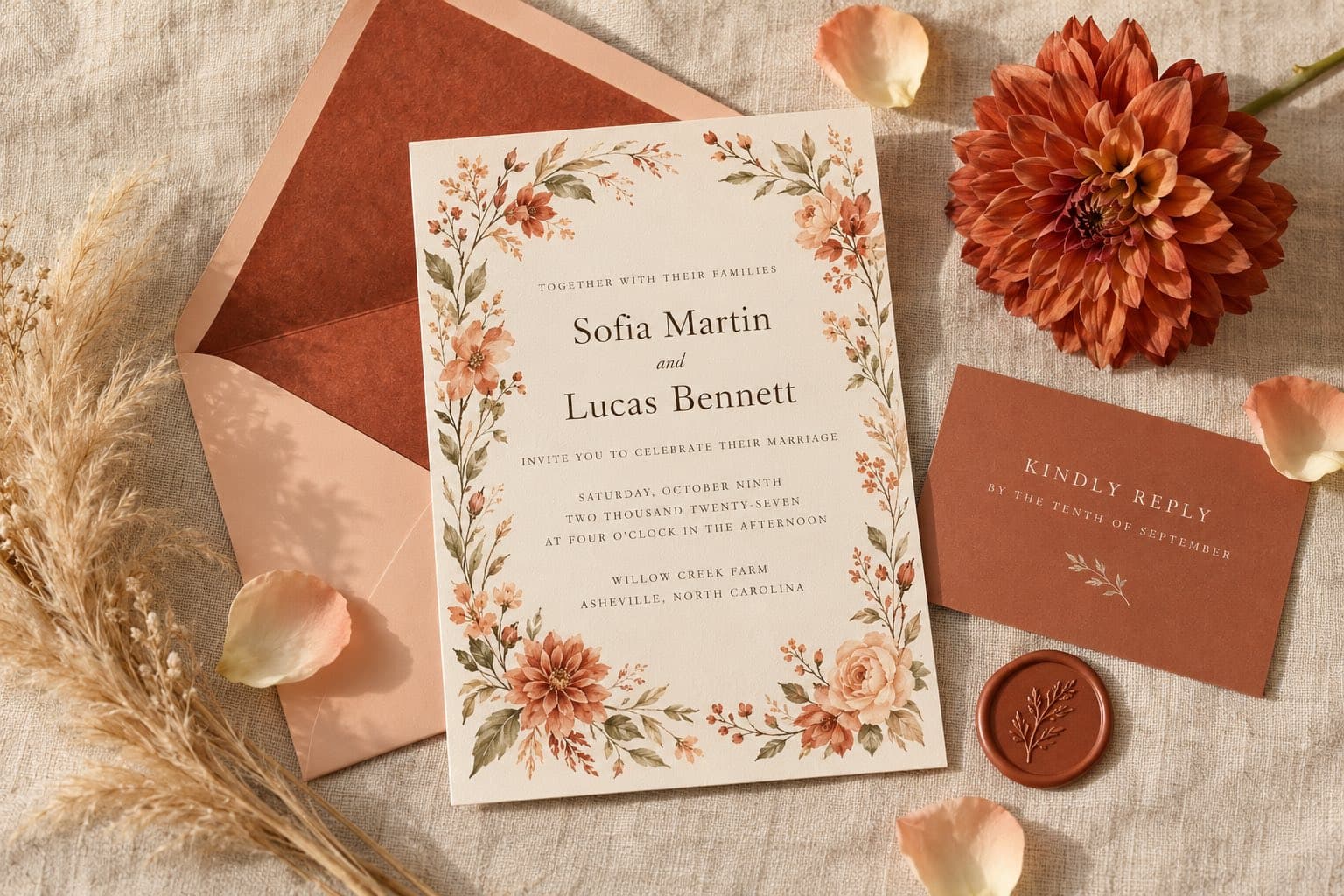
In Vowfly, this is Terracotta & Peach. Fontaine frames your names in a terracotta folk-art border, and Corinne, a watercolor wreath of rust dahlias and peach chrysanthemums, is the softer choice for an autumn wedding.
Heritage green and gold
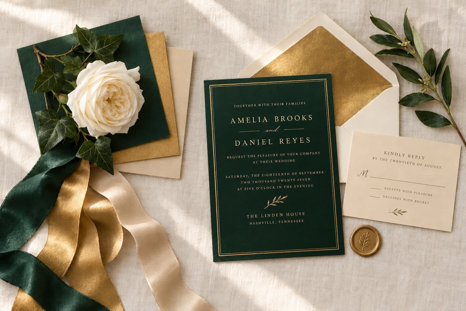
Emerald velvet, antique gold and a room full of flickering candles. Every detail feels like it belongs in a beautiful old love story.
This is you if: you love historic venues, vintage gold accents and the idea of getting dressed up for a truly special evening.
It has all the glamour of black tie, but it feels warmer. Emerald is flattering on almost everyone, and gold makes every detail shimmer.
How to bring it to life:
- Emerald velvet bridesmaid dresses, or one emerald suit for the groom.
- Gold chargers, flatware and candlesticks, with emerald velvet at the sweetheart table.
- A deep green invitation with gold lettering and a gold wax seal on the envelope.
Our tip: keep most of your flowers ivory. With deep green linens and gold everywhere, pale blooms keep the jewel tones from blending into one dark mass, and they glow in candlelight.
In Vowfly, this is Emerald & Gold. Our Emerald Confetti design scatters gold foil dots across a deep emerald card, made to match that palette's own gold.
Black and white
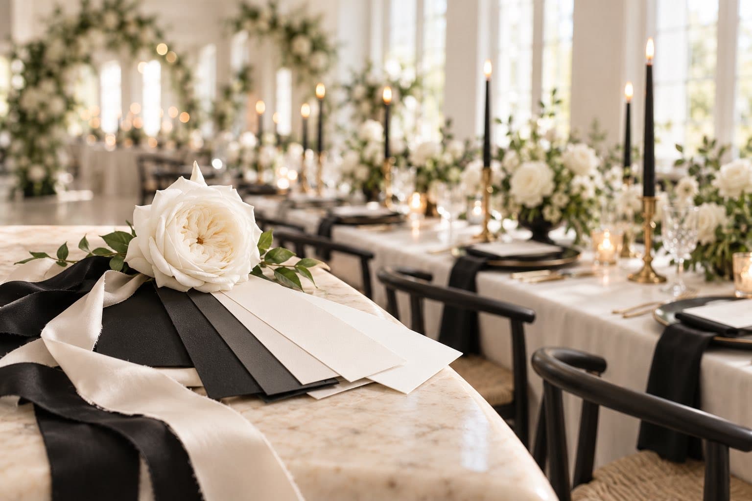
White roses, black satin bows and candlelit tables dressed for the occasion. Some color combinations simply know how to make an entrance.
This is you if: you love clean lines, classic fashion and a wedding that feels elegant without needing a single extra flourish.
It's the color pairing our own couples ask for most, and it keeps showing up in 2027 fashion. It suits any venue, it will never look dated in your photos, and it's the easiest palette to read on an invitation.
How to bring it to life:
- All-white florals with black-centered anemones and clouds of baby's breath.
- Slim black taper candles in brass holders down a long white table.
- Black tuxedos all around, or little black dresses for your bridesmaids.
Our tip: play with texture. Velvet, silk, lace and greenery keep black and white from feeling flat, and a warm ivory instead of stark white makes it feel inviting rather than formal.
In Vowfly, this is Black & White. Our Midnight Confetti design scatters gold foil dots across a warm near-black card, and Emeline is the quiet, all-ivory version.
Which palette fits your season?
Still deciding? Here's where each palette shines. Tap one to jump back to it.
Spring
Summer
Fall
Winter
How do you choose your wedding color palette?
If you're stuck between a few favorites, start with an invitation design you love instead of trying to perfect your whole mood board first. Your invitation is one of the first glimpses guests get of your wedding, and its colors can carry through to your website, flowers and reception details.
Once you've found a design that makes you both smile, pull three colors from it:
- One lead color. Your signature shade for bridesmaid dresses, flowers or statement details.
- One supporting color. A pretty partner for ribbons, linens and smaller accents.
- One neutral. Ivory, cream or white, to give everything room to shine.
Three colors are plenty. You can always add a little gold or silver for sparkle.
Will your colors work on a phone and on paper?
Before you fall completely in love with your colors, give them one little test. Open your invitation on your phone and turn the brightness down. Can you still read every word? Then print a copy at home. Deep greens and burgundies can look darker on paper, while pale lettering can be hard to see on a screen.
If something disappears, try changing the text color before giving up on your palette. Dark text on a pale card, or white text on a deep one, almost always works.
Start with the invitation
When you're ready, browse the Vowfly template gallery and find a design that feels like your day, or type a color like "sage" into its search. When you create your invitation with Vowfly, your palette carries through to your matching wedding website, so everything looks beautiful together from the very first invitation.
Next up: our timeline for save-the-dates and invitations and our invitation wording examples.